Sunday, February 28, 2016

The Printing Process

I use an etching press to make most of my prints. This is a mechanical process used in the 17th century by Rembrandt. Here are photos of a student at Suffolk County Community College pulling prints from a solarplate.
Inking and wiping the plate
After the plate is made, it is inked. The ink is pushed into the recessed areas and wiped from the surface, where the print will be white. The plate is placed on the bed of the press with a piece of dampened printmaking paper over it. The blankets (or felts) are placed on top, and the wheel is turned so that the press bed travels through the rollers. The pressure can be something like 1,500 lbs. per square inch!
pulling the print
The blankets help to push the paper into the recessed areas where the ink is transferred to the paper. In the second photo, you see the blankets thrown back over the roller of the press, and the print is being pulled from the plate.

If you want to see etchings from the 17th through 19th century, now is a good time. There are etchings by Rembrandt, Goya, Degas and Cassatt currently on view at the Metropolitan Museum of Art in New York. Contemporary etchings are on view at the Museum of Modern Art. For those of you who don't go to museums often, remember that not all works owned by a museum are on view. The exhibit is constantly changing. If you want to see a specific work of art, check the museum's website to see what is on display.

Friday, February 26, 2016

The Brayer

A brayer is the roller used in printmaking to apply ink to the surface of a plate. In the following image, the roll-up of ink is used in making a monotype with the subject image of a brayer. This was done in the print shop at C.W. Post campus of Long Island University, where I teach printmaking.

"Brayer," monotype, 9" x 12" 2015
This monotype started with black ink rolled up onto a Plexiglas plate. The ink was removed with a rag wrapped around my index finger, to reveal the shape of the black brayer and handle. The handle of a paintbrush was used to make some of the thin white lines. I left some black marks as shadows. The print was made on dampened white Hahnemuhle etching paper. The first pass through the press yielded a black and white print. I used yellow and red ink diluted with #0000 plate oil, rolled up on a second Plexiglas plate to make a second pass through the press. This is called a double-drop print. It requires accurate registration on the press bed. The ink transparency of the second drop allows the black image to show through.
     I drew this from observation, directly on the plate. The inspiration came from the cover of our printmaking textbook, The Complete Printmaker, by John Ross, Clare Romano, and Tim Ross. Here is the link to the book on Amazon: http://www.amazon.com/The-Complete-Printmaker-Techniques-Innovations/dp/0029273722


Wednesday, February 24, 2016

Black and White plus Two

One way that artists work with color is to limit the color. This monotype limits colors to black ink plus two. Colors mix a little on the plate while it is being inked and printed. The white of the paper is part of the color too. Inks that are applied lightly with the brayer show the white of the paper, appearing as a tint of the inked color.
"Bamboo Composition," monotype, approx. 9" x 12" 2016
Yellow is a difficult color to work with in printmaking. Yellow doesn't contrast well against white paper. This print uses a rollup of cadmium yellow, a strong yellow that does contrast. The red is a mixture of process red and black, to reduce the chroma. With black also rolled up on the plate with a brayer, it further mixes. The bamboo leaves and stems were placed on the plate so they act as a mask. The leaves are then flipped and run through the press twice. The pattern is evident in the lighter leaf shapes. The yellow and red work as a background, reading like a table-top with a still life in a vase.

The monotype process yields only one print. Here is how I made this. I inked a plate, in this case a Plexiglas plate, and then ran the plate through an etching press with dampened white paper.

Monday, February 22, 2016

Black and White

I'm looking through my art for a suitable small black and white image for a kitchen. Here is one possible piece, a still life etching completed in the 1970s. This was done by drawing directly on the zinc plate while it was coated with hard ground. There was no completed preliminary sketch, although I may have made a few thumbnail sketches to get the composition right. The tones are dependent on hatching and crosshatch lines. The mirror doesn't seem quite round, does it? But the ellipse of the small basket is accurately drawn.

"Still Life," etching, approx. 3 ½" x 4"
Artists' styles change over the years, and it is evident in the above etching that my style has changed. The subject of the still life was influenced by looking at the unique work of Giorgio Morandi. My composition and arrangement of objects is quite my own closely cropped style. Later, after 2006, I began opening up the space around objects, and relying on less formal hatching. The hatch work was influenced by Francisco Goya, who sometimes used the horizontal hatch lines like I have done in the background. Goya is better known for his work with aquatint. Here is an aquatint of mine.

"Irises in Vase," etching and aquatint, approx. 6" x 9 ½"

detail: "Irises in Vase"
The irises were drawn directly on the zinc plate with a Sharpie marker as the acid resist. The plate was then aquatinted to get the rich dark background. The subject matter was influenced by the beautiful monotype irises of Michael Mazur. I did a series of monotype black and white irises too. I'll show those at another time.


Sunday, February 21, 2016

There is no Frigate like a Book

Emily Dickinson is one of my favorite poets. Her short poems speak to my heart. So naturally, I made one of her poems the subject of a small artist's book, complete with an illustration of a steam frigate at the start, and the Montauk Lighthouse at the end.
"There is no Frigate like a Book," accordion book with monotype, graphite illustration, collage, and calligraphy, approx. 2 ½" x 3 ¼" when closed. (sold)
detail: "There is no Frigate like a Book"
The background is made from a discarded piece of 100% rag (pure cotton) BFK Rives etching paper. The ends show the deckle edge of this beautiful thick soft paper. The background printing is a monotype with plant impressions in tints of blue and yellow. The writing is my own calligraphy, done on handmade paper and glued into the book.

Here is Emily Dickinson's poem, so apt for a little book:

There is no frigate like a book 
To take us lands away, 
Nor any coursers like a page 
Of prancing poetry.  
This traverse may the poorest take 
Without oppress of toll; 
How frugal is the chariot 
That bears a human soul! 

Saturday, February 20, 2016

Exploring Muted Color

I've been thinking a lot about color lately, and working out color combinations with Prismacolor pencils. These are two sketches using muted color. I'm working out what colors I will use in future etchings.


These sketches use shades of purple, brown, grey, and pink. These nonobjective designs start with a small central rectangle and grow outwards. The first drawing has a dominant horizontal axis. The second drawing balances the horizontal and vertical axes. Both drawings rely on some diagonals to add a feeling of movement.

Friday, February 19, 2016

Winter Landscape: Skaters

I spent many happy hours skating on Cook's Pond in Westhampton Beach when I was a kid. This composition is drawn from several sources: photos of another frozen pond on Long Island, sketches of skaters done at Rockefeller Center, and memories of skating with my sisters.

"Skaters," watercolor, approx. 16" x 20"

Wednesday, February 17, 2016

February Blossoming Wildflowers

These wildflowers, a type of Spathe, bloom in February. Even in the snow, the unique blossoms of the Skunk Cabbage Symplocarpus foetidus, pop up in marshy areas of the Northeast. I like to go to the Quogue Wildlife Refuge and observe them. The root system generates heat and melts the snow. The bright green leaves come later. The name is from the look of the leaves. They resemble cabbage, and if you disturb or cut them, they have an awful odor. Since the Wildlife Refuge gives us a boardwalk to keep us out of the muck, you are not likely to experience this odor. I never have.

"Skunk Cabbage," colored pencil on vellum, 12" x 12"

"Skunk Cabbage," graphite on paper, approx. 5" x 7"
"Spathe," drypoint etching on BFK Rives paper, edition of 10, paper size 11" x 15", image size approx. 6" x 10" 

All the above were drawn from memory. The drypoint etching is an example of another Spathe plant, not a Skunk Cabbage.
     Drypoint etchings are drawn directly on a zinc plate with a sharp stylus that cuts into the metal. Ink is pushed into the grooves of the plate, then wiped off the surface with a starched cheesecloth called a tarlatan. Then dampened paper is pressed onto the plate, and run through an etching press under great pressure. The resulting print is unique each time it is printed. This photo shows the background so that you can see the deckle and torn edge of the paper. You can also see the plate mark, an indentation around the image. Etchings print with a slight three-dimensional effect. Even the lines are slightly raised.

Tuesday, February 16, 2016

Flowers in Winter

Winter is a time for looking forward to spring. I often paint or draw flowers in the winter. These two monotypes were done in January at C.W. Post, Long Island University's Old Powerhouse Printmaking Workshop.

"Flowers in Winter I," monotype,  9" x 12" 2016

"Flowers in Winter II," monotype, 9" x 12" 2016
The second monotype was done by adding color to the ghost image left on the plate. These were done with oil-based inks on a plexiglas plate, printed with the etching press.

Monday, February 15, 2016

The Atlantic Ocean

The ocean beaches on Long Island -- where I grew up and spent many sunny summer days -- are beautiful in winter, too. These two small oil paintings were done from a combination of photos and memory in warmer days, diving into the waves.

"Wave," oil on canvas, 9" x 12" (sold)

"Seascape, Atlantic Ocean at Westhampton Beach," 9" x 12"
I am fascinated by the ocean, at once beautiful and terrible. The constant motion of the waves, the changing color of the water, the difference from one day to the next, and the smell and sound of the sand and surf at any season is calming to my soul. Painting all that I see and feel as I walk along the beach is influenced by a lifetime of watching the waves. I had two teachers who inspired me to paint the ocean: Pete Klotz, my high school art teacher, and Marcose Blahove, who lived next door to me.

Sunday, February 14, 2016

Sketch Based on a Shape

I try to draw every day. Often I base the sketch on a shape. It might be a circle, a square, a triangle, or any other shape. Since it is Valentine's Day, the obvious shape is a heart. So here it is!

"Heart Shapes, February 14, 2016," graphite on paper, approx. 8" x 10"
What makes a good work of art? I think it is often the application of the principles of design as evident in this drawing. Contrast of size, a change in direction, contrast of value, repetition of shape, and a sense of movement are all part of the principles. The basic element of this drawing, the subject matter in this case, is the shape of the heart.

Saturday, February 13, 2016

Still Life Drawing: Sea Shells

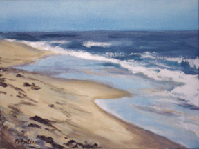
I live on Eastern Long Island, surrounded by water. The beaches on the Atlantic Ocean and the Long Island Sound are among the most beautiful on the planet! I've been beachcombing and collecting shells my entire life, so naturally I use the shells for still life. The following drawings are lifesize. I enjoy arranging shells in different combinations, making formal compositions within a rectangle. Each shell is carefully placed to make the most of the negative space on the page, and to show the shape in its most characteristic view.

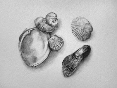
"Five Shells," graphite on watercolor paper, 6" x 9"
The tools to make these detailed drawings are simple: number 2B and 4B drawing pencils, kneaded eraser, white plastic eraser, single-edged razor blade (to sharpen the white eraser and pencils) tortillon for smudging, sandpaper pad to keep the pencil and tortillon sharp, strong natural sunlight, and smooth 100% rag watercolor paper.

"Four Shells," graphite on watercolor paper, 6" x 9"

You will notice that I don't try to pick out perfect shells. Some of these shells are broken, have drill holes, bleached and worn by the sun and salt water, and are deteriorated almost beyond recognition. Shells on a beach can be 100 years old! Or they can be fresh that week. Common shells on Long Island beaches included in these drawings: hard clam (quahog), ribbed mussel, scallop, cockle, moon snail shell, and slipper snail shells. The slipper shells come from the north shore beaches, and from Orient Point.

Friday, February 12, 2016

Small Handmade Book

Book arts are part of printmaking for me. The possibility of making something that can be touched, where the texture of the paper and the scale of the three-dimensional object is felt as well as seen is a way to translate the magic of printmaking for the viewer. If you can hold, see, smell, and turn pages of a work of art, walk around with it in your hand, it becomes much more personal. My books sometimes have words and images, but this one does not. The color, texture and shape is the message. Since it is a three-dimensional object, I am showing several photos from different open positions. The book has two red covers, made from handmade paper.

Handmade book, handmade paper and folded monotype, printed with Akua intaglio ink, approx. 2 ¾" square


This book is a one-of-a-kind work of art. The monotype and hand assembly of the covers makes it impossible to duplicate.The inks used are Akua water-based intaglio inks. The pages have tints of yellow and blue, but what doesn't really show in a photo is the inclusion of gold. The pages sparkle as you turn them.

Wednesday, February 10, 2016

Landscape Abstractions

Landscapes have their special challenges. The basics are horizontal and vertical elements. These two prints are based on those abstracted elements, without reference to a specific place. They are imaginary landscapes, similar to the concept of the collages posted yesterday.
"Landscape," editioned solarplate etching on BFK Rives paper,  approx.  6" x 9" (sold)

"Landscape," monotype, approx. 9" x 12" (sold)

Monday, February 8, 2016

Collage

Collage is different than any other artform. I save scraps of discarded paper or fine art papers and combine them by cutting or tearing into shapes and overlapping or fitting them onto a rectangle or a square. When I find a pleasing composition, I glue the pieces down. The contrast, direction, texture, and color of the papers are important. No subject matter is needed, but vertical and horizontal movements suggest landscape.
Untitled, Collage on bristol board, approx 5" x 5"

Untitled, Collage on bristol board, approx. 3" x 5"

Saturday, February 6, 2016

Painting Water

I love to paint on location. These two paintings were completed during the Wet Paints event at the Phoenix Gallery in Bellport, NY during the summer of 2014.
"Bellport, Windy Day" (afternoon), Oil on Canvas, 16" x 20"
Detail, "Bellport, Windy Day"
Painting water as it is moving without reference to a photo is challenging, especially on a windy day as it was here. I find it necessary to sit and watch the water for a long time before actually applying the paint to the canvas. I look for shape and color in the waves, and at the relative size of the wave from horizon to shore. The brushmarks become an abstraction.
"Moored at Bellport" (painting in the morning). Oil on Canvas, 8" x 10"

detail, "Moored at Bellport"

This small sailboat was difficult to get right because it is so small on the 8" x 10" canvas. It is only about 2 and a half inches high! Notice the relative smoothness of the water near the horizon as compared to the water at the bottom of the canvas. The whitecaps are still evident.

Friday, February 5, 2016

Monotype Series

Monotype is one of my favorite ways to create. These three prints took two days to complete during the last two weeks. The object is a small white cream pitcher. I drew it several times to tell the story of a pitcher falling from a shelf. What a challenge to draw an object from observation in different positions on the same page and still achieve a balanced composition! Although a monotype is technically only one print, I got three variations by manipulating the original image in three ways.
Falling Pitcher I, Monotype, 18" x 24"

Falling Pitcher II, Monotype, 18" x 24"

Falling Pitcher III, Monotype and mixed media with chine collee, 18" x 24"
Monotype is a fun printmaking technique. I used a plexiglas plate to roll up black etching ink, then removed it with a rag and a paintbrush to show the white areas. I printed with an etching press onto dampened white paper. The first print is the original, but on the plate there is a "ghost." It printed the second, a light grey print at the first pass through the press. On the plexiglas, I repainted the white areas yellow, and the black area blue, and printed on top of the light grey ghost print. The third print was another ghost print that was reprinted first with a blue background and then with paper glued to the vases, and printed once again with a transparent red. I wasn't completely satisfied with the final output, so I touched it up with Caran d'Ache crayon. Actually, this photo was taken about midway through the touchup, but it is still fairly accurate.

Wednesday, February 3, 2016

Figure Drawing

The figure is probably the most difficult subject matter for artists. I can't say it's easy for me. Here are two drawings, one carefully drawn from a one hour pose, and the other quickly rendered from a ten minute pose. When I draw the figure, I'm concerned not only with getting an accurate rendition of what is in front of me, but also with the composition on the page. Skills for figure drawing include ability to render the human form with accuracy in anatomy and proportion. Artists study for years to be able to get it right.
Figure Drawing, Charcoal on Paper, 18" x 24"
Male Figure, Mixed Media on Paper (pencil, charcoal, watercolor crayon), 15" x 15"

Tuesday, February 2, 2016

Etchings

These two monoprints are each printed with two zinc plates. The brown background plate is a softground nature print. The forground black plate is a softground drawn plate, with a drawn image of a figure on a vase, also imprinted with some plants. The figure is inspired by the artist and typographer Eric Gill. The final prints have plant matter, rolled up with blue ink included. A monoprint is a print made with a plate that forms a static matrix, but the artist changes the image with the way it is inked. Both of these images are printed on the etching press at C.W. Post campus of Long Island University at Brookville, Long Island, NY. I'm not finished exploring these two plates. I can print in different colors, and change the image on the center plate. Do you have any suggestions of colors I might try?

Muse in a Vase, Monoprint, approx. 7" x 9"

Muse in a Vase, Monoprint, approx. 9" x 12"

Monday, February 1, 2016

Drawing from Observation

One of my favorite past times is to draw from life with charcoal. The following drawings were done at the Patchogue sketch club last January. These two drawings are actually the same vase. The first is very controlled. The second was done after I warmed up, and allowed myself much more freedom. Which do you prefer?

Vase I, Charcoal on paper, size 18" x 24"

Vase II, Charcoal on paper, size 18" x 24"